

 What Is CRI Really Measuring, and Why Does R9 Matter So Much?
CRI (Colour Rendering Index) is a spec that shows up on almost every LED packaging, usually as a single number out of 100. Most people know "higher is better," but far fewer know what that number is actually measuring — or that it has a well-known blind spot that a related figure, R9, is specifically designed to expose.
What CRI Is Actually Measuring
CRI measures how accurately a light source reveals the true colours of objects, compared to how those same objects would look under natural daylight or a reference incandescent source. A perfect CRI of 100 means colours appear exactly as they would under that reference light. Lower scores mean colours can look shifted, duller, or slightly "off" compared to how they'd naturally appear.
This matters more than people expect, because it affects how food looks on a plate, how skin tones look under bathroom or vanity lighting, how accurately paint colours or fabric swatches read, and how "true" a room's colours feel overall — even if you can't immediately pinpoint why something looks slightly wrong.
How CRI Is Actually Calculated
Here's the part that surprises most people: CRI isn't measuring colour rendering evenly across the board. It's calculated using eight standardised colour samples (labelled R1 through R8), which are mostly moderate, pastel-ish tones — light greyish red, dark greyish yellow, strong yellow-green, moderate yellowish-green, light bluish-green, light blue, light violet, and light reddish-purple. The light source's rendering of these eight samples is compared against the reference light, and the results are averaged into the single CRI number you see on packaging.
The issue is that these eight reference samples are all relatively low-saturation colours — and none of them is a strong, saturated red. This is exactly where many LED sources struggle the most, and it's why the story doesn't end at R8.
Beyond R8: The Extended Samples, R9 to R15
Lighting standards actually define a fuller set of test colours, going all the way to R15. These extra samples don't count toward the main CRI average, but they reveal things the headline number hides:
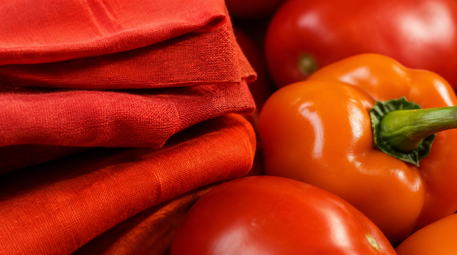
R9 — Strong red. The most talked-about of the extra samples, and for good reason: saturated red is genuinely difficult for many LED chips to reproduce faithfully, yet it's one of the most common colours in everyday life.
R10 — Strong yellow. Tests how well a light renders vivid, saturated yellows, relevant for anything from yellow furnishings to certain foods.
R11 — Strong green. Checks rendering of vivid greens, useful for judging how plants, greens on a plate, or green décor will actually look.
R12 — Strong blue. Tests saturated blue rendering, relevant for blue fabrics, tiles, or printed materials.
R13 — Light yellowish pink. This sample approximates a lighter (often Western/Caucasian) skin tone, making it directly relevant to how flattering — or flat — a light makes people look.
R14 — Moderate olive green. Modelled on leaf green, useful for judging how natural foliage or green plants appear under a given light.
R15 — Asian skin tone. Added later specifically to give a second, more representative benchmark for skin tone rendering across a wider range of skin tones, since R13 alone doesn't capture that well.
Why R9 Still Gets Singled Out
With seven extra samples to choose from, R9 remains the one manufacturers and lighting professionals talk about most — because saturated red shows up constantly in ordinary home life (skin flush, red furnishings, wood grain with reddish undertones, red food like tomatoes and meat) and because it's genuinely one of the hardest colours for many LEDs to get right. A light source can score a high overall CRI — say, 90 or above — while still having a very poor R9 score, sometimes even a negative number, because that one weak point never factors into the headline average at all.
That said, R13 and R15 deserve more attention than they typically get, especially for lighting in bathrooms, dressing areas, or anywhere skin tone rendering genuinely matters — a high CRI number says nothing about how flattering (or unflattering) a light will actually look on skin.
What to Actually Look For
Since R9 through R15 aren't part of the standard CRI average, they usually aren't printed on typical consumer packaging, but manufacturers of quality lighting products often list them separately in technical spec sheets (sometimes under an extended or "Re" rating). As a general guide: a CRI of 90 or above is a reasonable baseline for spaces where colour accuracy matters (kitchens, bathrooms, dressing areas), and where the fuller R9–R15 figures are available, looking for positive, reasonably high scores — particularly for R9 and R13/R15 if skin tone matters for that space — gives a much fuller picture than the CRI number alone.
The Takeaway
CRI is a useful starting point, but it isn't the whole story — its averaging method can hide real weaknesses in how a light renders saturated colours and skin tones, which is exactly what the R9 to R15 samples were created to reveal. For spaces where colour accuracy genuinely matters, it's worth looking past the single CRI number and checking whether the extended R9–R15 data is available before deciding.
0 Comments
There are no comments for this article. Be the first one to leave a message!